
Have we gone too far, and how do we make surprise & delight moments special again?
OK GO uses 75 pounds of confetti per show. 75. POUNDs.
I recently saw them live on their recent reunion tour. Every blast of confetti (these happened every 3 songs) was a joyous moment perfectly fitting the celebratory atmosphere.
Confetti falls on a sea of fans at an OK GO concert at The Basement East in Nashville. Source: Author
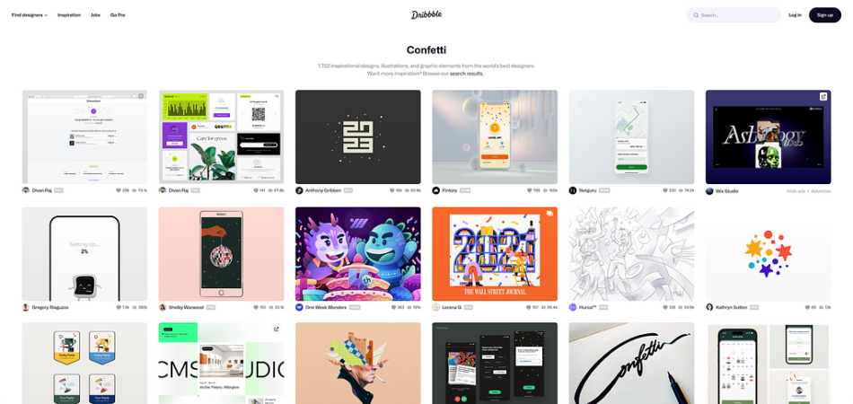
Confetti has a time and place, and digital experiences are not concerts. Somehow, there are more than 1,600 confetti designs on Dribble!
Confetti has found its way into products and moments that no one would have expected five years ago. It is in half the texts we send, on every complete page we land on, and practically overflowing from our devices.
Surprise and delight moments in your product should be surprising and delightful, as their name suggests. After years of being pummeled with confetti on every screen we look at, a confetti burst at a special moment is neither surprising nor delightful anymore.
So what do we do? How do we reclaim these moments and deepen their meaning to our customers?
Why surprise & delight your customers at all?
Surprise and delight moments accomplish three critical things.
They strengthen customer loyalty.They drive word-of-mouth.They create an emotional response in the customer.They make experiences stickier.
A study by Loyalty One found that 90% of customers who had a surprise & delight moment had an “elevated positive perception of the brand,” and 50% of customers “told peers about the experience”.
Looking at the Kano Analysis (a framework for customer preference), surprise and delight moments have been found to drive an emotional connection to the brand in customers.
In Made to Stick (audiobook), Chip and Dan Heath say this regarding surprise:
“How do we get our audience to pay attention to our ideas, and how do we maintain their interest when we need time to get the ideas across? We need to violate people’s expectations. We need to be counterintuitive. A bag of popcorn is as unhealthy as a whole day’s worth of fatty foods! We can use surprise — an emotion whose function is to increase alertness and cause focus — to grab people’s attention. But surprise doesn’t last. For our idea to endure, we must generate interest and curiosity. How do you keep students engaged during the forty-eighth history class of the year? We can engage people’s curiosity over a long period of time by systematically “opening gaps” in their knowledge — and then filling those gaps.”
Overall, emphasizing positive moments in digital experiences should have a positive impact on your product, but as always, make sure to A|B test to ensure your updates have the intended effect.
Let’s look at some examples of when animations work and when they don’t.
When does confetti work well?
Confetti, and animations, in general, work well when the animation is deserved.
A great example of this is LinkedIn. When someone gets hired for a new job, LinkedIn displays one of a rotating circle of different animations highlighting the milestone.
An animation showing confetti and streamers exploding out of colorful canons. Source: LinkedIn
This highlights two important factors when choosing whether to use an animation — (1) importance of the event to the user and (2) frequency.
Getting a new job is a huge milestone for most people. It is the culmination of prepping a resume, writing countless cover letters, reaching out to an endless stream of people, interviewing, negotiating an offer, and finally landing a job. If ever there were a time to use an animation, landing a dream gig would be it.
Also, users do not get new jobs every day. It is not a scenario in which the user will be pummeled with the animation, rendering it meaningless.
So when can animations fall flat?
When does confetti fail?
Animations can backfire. At the wrong moment, an animation could be a glaring example of bad design.
Robinhood, Zoom, and Apple provide several examples of how animations can backfire.
Robinhood became popular as an app that made buying stocks as easy as ordering delivery. The app’s animations and behavior reinforced this. Simply put, these animations made investing more addictive.
This led to them changing from a confetti animation to something much more subdued (see below).
An animation celebrating a user’s first trade on the Robinhood app. Multiple 3-D green shapes (diamonds, blocks) float into the screen once a user completes their first trade. Source: Robinhood
Critics say that using animation at this moment pushes un-savvy investors to get more addicted to the app and invest more of their money.
Having animations at moments that are designed to hook users into a potentially unsavory habit is poor design. Yes, maybe these benefit the product or business goals, but they do so at the cost of hurting society. In these cases, animations should be subdued or not included at all.
Zoom and Apple provide other examples of when animations can have unintended effects.
Zoom recently introduced a host of animations under a feature called “gesture recognitions” (Apple calls theirs “reactions”). One that stands out is the celebratory animation that occurs when a user puts two thumbs up. While this is fun and great, there are stories of this backfiring.
People put their thumbs up for many reasons.
A friend recently was on a video call discussing layoffs, and someone put their thumbs up to signal agreement with a statement. Unfortunately, the animation played even though the tone of the conversation was somber.
This highlights another principle — always consider the edge cases. Edge cases like this are definitely unintended but well within the realm of possibility.
Make sure to talk through all the scenarios that could lead to an animation with your team.
Digital confetti floats in front of a man holding up both hands with the peace sign. Source: Apple
F-E-A-T: the surprise and delight framework
Several key factors should be considered when deciding whether to add a surprise and delight animation and what kind to add.
Using the FEAT framework will help you determine if and how to celebrate a customer moment with an animation. The highest emotions come after accomplishing something that feels like a feat, so we thought the acronym was a good fit.
Frequency
Emotion
Animation
Transition
Frequency
Start with frequency. How often does this moment happen for your customer? Users don’t want to be inundated with animations.
Is the moment an everyday occurence or something really special? If it’s an ordinary thing, it does not need to be met with an extraordinary response.
If it’s something the user has been building to for weeks, months, or years, then bust out the confetti.
Frequency should always be the first question you ask as it’ll quickly answer whether you should add an animation or not.
Emotion
Think through the emotions your users are feeling at the moment. Is it a high high for them or more of a slight boost? Is that feeling going to be shared by the majority of users going through this experience? Or is there a chance you’ll have a significant percentage of users feeling the opposite of what you expected?
You don’t want to celebrate unless most of your customers feel like joining the celebration. And you want to consider what other emotions customers may be feeling in the moment. If emotion may be shared by more than just a few users, you should really consider if an animation is the right thing to add at that moment.
Animation
The animation should match the emotion and frequency of the moment. You don’t want to overwhelm customers.
Confetti for depositing a check seems like overkill. Confetti for buying a house is a different story. Match the design of the animation to the gravity of the moment.
This is the surprise moment for which you’ve been building anticipation. From Aaron Walter’s Designing for Emotion:
“Surprise is always followed by a proportional emotional response. After the brain detects a surprising contrast, it has to figure out how to respond quickly. There’s not enough time for deep, intellectual contemplation, so the brain relies on emotion to provide a “gut reaction.” Interface designers love creating this sort of response in users because, if done well, surprise that triggers the right gut reaction bypasses cerebral judgements that might prevent users from clicking, signing up for a service, or buying. But keep in mind, our goal here is not to deceive or trick. Your audience will catch on to your game and will not trust your brand if you are deceitful. We want to build positive perceptions of our brand to create lasting brand loyalty.”
Keep the animation in line with the user’s emotion, and it’ll be smooth sailing.
Transition
After the animation, you need to consider how to transition the customer back into the experience at the desired point. You have hooked the customer and it’s an opportune moment to transition them to do something that gets them further invested in your experience.
In Nir Eyal’s Hooked (audiobook), this is the last phase of the The Hook Model flywheel and he defines it in this way:
“The investment phase increases the odds that the user will make another pass through the Hook cycle in the future. The investment occurs when the user puts something into the product of service such as time, data, effort, social capital, or money.”
Every time you are considering if and when to add an animation, just remember to walk through F-E-A-T, and you will make the right choice.
A few additional considerations
Sometimes smaller is better
Confetti isn’t the only option.
Imagine the surprise and delight moment happening in real life. For example, if you just completed your taxes, would you want someone to dump a ton of confetti on you? Probably not—the surprise is not equivalent to the accomplishment.
Now, if someone were to give you a high five, you’d probably accept and feel happier than if you were high-five-less.
The Peloton app does this subtly and seamlessly. A quick click on your friend’s face sends them a high five. If you’re the receiver, this is shared with you and is a nice motivator that strengthens the feeling of community in the experience.
A animation of a high five icon appears on a user’s profile image in the Peloton app. Source: John Abella on Medium
If you’re looking for more alternatives, Alex Zlatkus (Writing for UX Collective) shared many examples of different spins on confetti.
Don’t have an animation at all
The final alternative animation is the absence of one.
If you’ve built a truly great experience, a little Salt Bae sprinkle across the screen isn’t going to change anyone’s mind. And if your experience isn’t great, an animation may only emphasize how not magical the experience was.
In Harvard Business Review, Matthew Dixon, Karen Freeman, and Nick Toman argue that reducing customer effort is more important than surprising and delighting customers. Therefore, it might be better to focus your efforts on removing friction from your experience instead of delighting customers at key moments.
If you are helping your customers solve a problem, a surprise and delight animation is a nice-to-have but not a need-to-have. It may have some additional impact (and this should be tested) but don’t just throw confetti on it for confetti’s sake.
Animations as an afterthought
Animations are often the last on a team’s list of priorities. It can be very easy to push these aside and say that they won’t make a difference.
Always push for animations if you think they’re justified as they can often be the thing that adds life to your experience and keeps users coming back.
At the end of the day, animations make experiences fun. Sure, they’re not always needed, but when they fit, they can make things a lot more delightful. And while not a concert, wouldn’t you like your users to feel some of the rush of a confetti cannon being blasted into the air?
Do you use confetti or animations in your experiences to surprise and delight guests? If so, please drop a line below and let us know how you use them.
And as always, thank you for reading!
The over-confetti-ing of digital experiences was originally published in UX Collective on Medium, where people are continuing the conversation by highlighting and responding to this story.


