Weekly curated resources for designers — thinkers and makers.
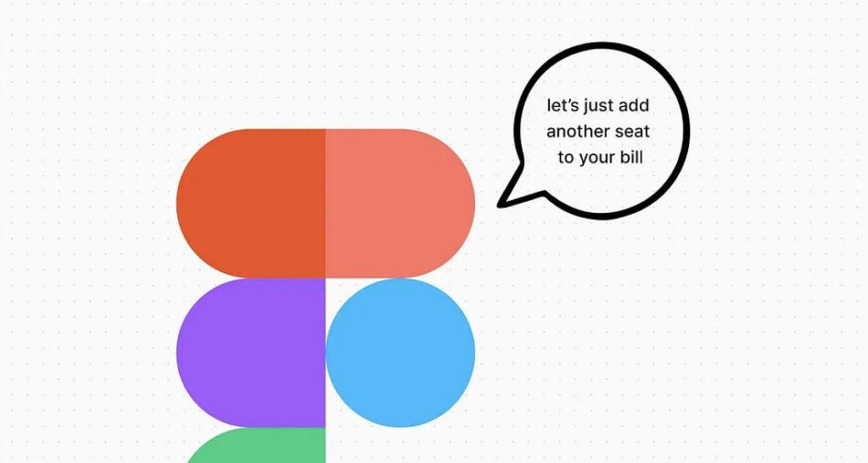
“The number of paying teams is a big KPI for Figma right now, as well as the average revenue per team.
I got this sense from seeing a whopping eight prompts to upgrade in a single session and seeing a notable increase in the urgency of their upgrade messaging; now it’s all ‘last file’, ‘0 left’, and ‘you’re running out’.”
Figma and the cost of collaboration →
By Rosie Hoggmascall
It’s like having your customer on speed dial →
[Sponsored] Dovetail’s magic search allows you to query everything your organization knows about the customer. Pull from interviews, usability testing, industry reports, and user feedback — and get an instant, shareable insight. Available on our professional package — but UX Collective subscribers can try it free for 30 days.
Editor picks
The lost practice of information architecture →
And the perils of designing without a plan.
By Vicky TeinakiThe future is up for grabs when anyone can make designs →
What AI-generated design means for creators.
By Elaine LuDesign has a granularity issue →
Why we need to move towards a new design philosophy & practice.
By Kevin RichardThe limits of “data-driven” →
Making decisions based on easy data is a recipe for disaster.
By Pavel Samsonov
The UX Collective is an independent design publication that elevates unheard design voices and helps designers think more critically about their work.
Home as a heuristic: good design starts here →
By Michael McWatters
Make me think
The AI job interviewer will see you now →
“Once seen as a curiosity, AI job interviews have grown in popularity as startups look to build businesses on top of the surprising capabilities shown by platforms like OpenAI. (…) As companies scramble for ways to integrate AI into their business, bad experiences like that are set to become commonplace.”A proliferation of terms →
“Do we call it a library, a folder, a collection, a workspace, a section, a category, a topic? How about a document, page, file, entry, article, worksheet? And.. what’s the difference? While these kinds of decisions might not be front and center when working out designs for a product or feature, they can impact a lot.”Our new religion isn’t enough →
“Religious faith has collapsed, and many trends and movements have moved in to fill the void. (…) I really don’t think it’s an exaggeration to say that a significant majority of young people now interpret their lives and emotions and relationships through a therapeutic lens.”
Little gems this week
The evolution of attention →
By Darren Yeo
The blurring boundaries of AI-powered design →
By John Moriarty
Who do we see when we gaze into the digital mirror? →
By Dr. Adam Hart
Tools and resources
I tried Figma Slides; here’s what I’m missing →
Asking the Figma Gods to bring these features ASAP.
By Raquel PiquerasDesigning for forgiveness →
How to create error-tolerant interfaces.
By Tetiana SydorenkoSimple recall testing for B2B UX →
A useful and cheaper alternative for B2B UX testing.
By Olesia Vdovenko
Support the newsletter
If you find our content helpful, here’s how you can support us:
Check out this week’s sponsor to support their work tooForward this email to a friend and invite them to subscribeShare open positions on our job boardSponsor an edition
The cost of Figma, the limits of data-driven, designing for forgiveness was originally published in UX Collective on Medium, where people are continuing the conversation by highlighting and responding to this story.


