
What branding can teach us about making science captivating
As a designer working with scientists, one question consistently arises when creating logos and identities for scientific institutions: how to symbolize the abstract and complex nature of science?
This question brings together two seemingly unrelated worlds: branding and science. At their junction, we find revealing insights about both fields: how science presents itself to the world, and how branding can convey complex, abstract ideas.
Historically, branding emerged from the need to identify ownership. Ancient Egyptians marked cattle by burning a small symbol onto their skin, defining possession. This is my cow, don’t steal it. This simple mark added meaning and created value. The word branding itself derives from brandr, a Viking term meaning to burn. From ancient cattle to modern corporate identities, branding effectively “burns ideas into our minds”. It links a product, service, or institution to a broader concept, transforming a simple symbol into meaningful associations. At its core, this remains the essence of branding today, whether for a farmer’s livestock or a cutting-edge research institute. So, how can we create symbols that represents science and the pursuit of knowledge? What can branding teach us about communicating science?
Heidelberg University seal (1386) & Max Planck Society Senator’s badge (1927)
Borrowing authority
First, let’s explore how science has branded itself throughout history. While the term science as we understand it today dates back to the 19th century, institutions of knowledge have a much longer history. In medieval Europe, monarchs established these institutions, using their own names, coats of arms, and seals. By sharing these royal symbols, rulers lent credibility to these institutions while simultaneously asserting their power over the knowledge produced. We can see an illustration of this practice in the 1386 seal of Heidelberg University (image on the left) — one of the oldest examples I could find. The seal depicts the institution’s founding: the king’s representatives kneel on either side of the apostle Peter, the university’s patron saint. Here, the institution is symbolized through emblems of authority: the monarchy and the church.
The 19th century marked a turning point. As knowledge liberated itself from monarchs and popes, the Industrial Revolution caused a major shift in branding. Mass production led companies to adopt abstract signs to distinguish themselves in the new consumer market. Science, too, sought its own unique symbols. Different institutions approached this challenge in various ways. For instance, the Max Planck Society chose Minerva, the Greek goddess of wisdom, as its emblem in 1927 (image on the right). This choice, inspired by the era’s renewed interest in ancient symbolism, offered a universally recognized icon of knowledge while cleverly distancing the institution from traditional symbols of power and religion.
From medieval seals to mythological figures these symbols sought to convey authority and trust. This approach highlights the positioning of scientific institutions within society rather than illustrating the nature of scientific work itself.
Los Alamos Scientific Laboratory business card (late 1960s) & Genomic Disorder Research Center by Brian Sadgrove (1998)
Pursuing truth
The modernist movement of the early 20th century revolutionized graphic design and branding through simplicity, abstraction, and functionality. In the context of science institutions, designers began distilling complex scientific concepts into simple, memorable visual forms. Drawing inspiration from cutting-edge scientific imagery — from the microscope to the telescope — they transformed elements invisible to the naked eye into powerful, recognizable symbols. A prime example of this approach is the Los Alamos Scientific Laboratory logo (image on the left) from the late 1960s. It depicts a Feynman diagram: a visual representation of subatomic particle behavior and interaction. By incorporating actual scientific representations it prioritizes scientific accuracy over purely aesthetic concerns.
Some logos push abstraction to its limit. The 1998 logo for the Genomic Disorder Research Center (image on the right), showing a broken DNA strand, exemplifies this approach. Its designer, Brian Sadgrove, articulated the philosophy perfectly: “simple is very close to true.” Here, minimalism isn’t just an aesthetic choice, but a path to convey scientific truth. By stripping away details, it compels viewers to engage directly with fundamental scientific principles.
Beyond burning their mark into our minds, these brands serve a second purpose: they are educational tools, communicating fundamental scientific principles through abstract shapes.
Fermilab drawings, logo and color palette by Angela Gonzales (1967–1999) & Hochschule Karlsruhe by Capital (2021)
Tools as symbols
The Fermilab logo offers us another approach to branding science. In 1963, the US embarked on an ambitious project: building its most powerful proton accelerator, the National Accelerator Laboratory — later renamed Fermilab. One of its first employees was Angela Gonzales, a German-born graphic artist who quickly became the “aesthetic gatekeeper” of Fermilab. For over three decades, her influence was ubiquitous: she “chose a color scheme for the site; drew decorations for walls; designed tables, desks, jewelry, and flags; illustrated posters and publications; and designed notepaper and announcements for special occasions,” among countless other contributions. Gonzales developed a unique aesthetic inspired by physics, seamlessly integrating elements from the subatomic to the cosmic scale, shaping Fermilab’s distinctive identity. Her work brilliantly showcases how design and science can complement each other. At the heart of her legacy is the Fermilab logo (images on the left), inspired by the accelerator’s magnet shapes and the lab’s overall architecture. This powerful and timeless emblem exemplifies the use of technical elements as recognizable symbols. Through Gonzales’s work, research is symbolized by its own tools and infrastructure, by its tangible mark on the world.
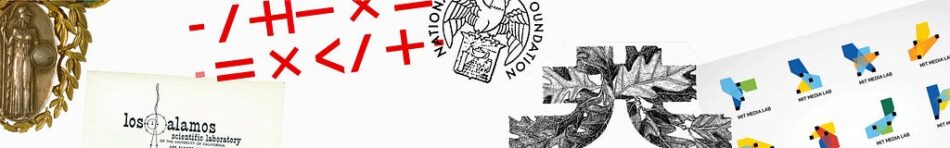
Some scientific tools, however, are more abstract than others. The 2021 identity for Hochschule Karlsruhe, designed by Capital (image on the right), exemplifies this approach. Centered around universally recognized mathematical operators — addition, subtraction, multiplication, division, and others — it directly references the university’s core competencies. Notably, the brand incorporates these mathematical symbols as key design elements, culminating in a main logo where the letters HKA are cleverly constructed from or inspired by operator shapes. By adopting these common mathematical symbols, the brand not only distinguishes itself but also communicates about science through its fundamental means of experimentation and analysis. This shows how the most theoretical aspects of science can be transformed into powerful visual symbols.
National Science Foundation logos (1950, 1972) & MIT Media Lab by TheGreenEyl (2010)
The process of science
The 20th century witnessed a shift in the perception of science, going from a linear accumulation of knowledge to an iterative and collaborative process. This shift influenced how scientific institutions brand themselves. The evolution of the National Science Foundation logo illustrates this change. Initially created in 1950 as an heraldic eagle holding a crest — echoing earlier science brands that borrowed symbols of authority — it transformed in 1972 into a minimalist, almost abstract design depicting people holding hands on a round planet (images on the left). This transition extends to the typeface as well, evolving from authoritative pointy uppercase letters to soft and humane lowercase ones. The overall shift reflects a broader evolution: from symbols of power and knowledge to representations of science as a collaborative, global endeavor.
When discussing representations of the scientific process, the MIT Media Lab’s 2010 identity by TheGreenEyl (image on the right) stands out. Inspired by generative and parametric design, this innovative branding system uses an algorithm to produce a unique logo for each faculty member, staff, and student. Each logo comprises three cones, symbolizing an individual’s contribution to the institution. While individual logos may not be striking in isolation, the brand’s power emerges when they are combined and set in motion, making the underlying logic apparent. This identity stands as one of the most compelling examples of branding that truly embodies the act of doing science, showcasing its dynamic and collective essence. Generative design, motion, and evolving visual systems help bridge the gap between abstract scientific processes and public understanding by showcasing science as a living, breathing human activity.
We The Curious by Smith & Milton (2017) & Natural History Museum by Pentagram and Nomad (2023)
Connecting through emotion
In recent decades, science museums have played with a powerful branding tool to make science accessible and exciting: emotions. A notable example is the 2017 identity created by Smith & Milton for We The Curious, a science center and museum in Bristol, UK. The logo (image on the left), composed of full and half circles, spells out the word curious when deciphered. Its playful design is clearly aimed at families and children, inviting interaction and exploration. At first glance, it fulfills its mission: prompting viewers to look, think, search, wonder, and react. It literally encourages a hands-on approach to science and connects the general public, especially younger audiences, with the institution through curiosity and engagement.
The 2023 identity for London’s Natural History Museum, created by Pentagram and Nomad (images on the right), offers a more subtle yet powerful approach. The icon comprises NHM — the museum’s initials — arranged in circular patterns that evoke waves and movement. Interestingly, these shapes also suggest a loud voice, which aligns with the museum’s role as an advocate for nature and science. The designers aimed to portray the museum not as a “passive catalogue” but as an “active catalyst”. With its bright colors, nature-inspired motion and a focus on its core mission, the brand connects with its audience.
While museum brands represent science differently from universities or research institutions, they reflect our relationship with science. Their branding strategies, focused on creating deep, powerful emotional connections, elicit strong, authentic responses that resonate with the audience.
Science branding framework
This exploration of science branding reveals four key strategies for creating value: displaying authority and knowledge, enabling accessibility and curiosity, showcasing tools, infrastructure, and scientific symbols, and finally portraying science as a human process.
We can map these strategies on two main axes: relationship to the audience, and representation of science. This framework allows us to better understand science branding’s underlying goals. Brands using symbols of authority and knowledge rely on symbolism to create trust. The same phenomenon applies to brands showcasing their tools, infrastructure, and unique symbols. They’re presenting tangible proof of science to build credibility. On the other hand, some brands portray science as a human process — an iterative collaboration that’s constantly changing and evolving. This approach creates a deeper sense of engagement with the public. We see this taken even further with brands prioritizing accessibility and curiosity as their main goals. Both of these strategies use emotional connections to get people to care about science.
These branding strategies and tools should inspire everyone involved in communicating science, offering powerful ways to engage, educate, and captivate the public about the world of scientific discovery and innovation.
This exploration of science branding reflects insights gained from years of collaboration with scientists. If you’re looking to enhance your science communication through effective branding, get in touch at www.louischarron.io
Sources
Branding: A very Short Introduction, Robert Jones, Oxford University Press, 2017
Exploring the brand of science: implications for science communication research and practice, Todd P. Newman, Becca Beets, JCOM, 2023
https://jcom.sissa.it/article/pubid/JCOM_2202_2023_A05/
Conversations with Designers: Brian Sadgrove, AGDA, 2010
https://vimeo.com/13875542
How to brand science? was originally published in UX Collective on Medium, where people are continuing the conversation by highlighting and responding to this story.


