
An unsolicited case study on the productivity loss associated with LinkedIn Jobs
Job hunting can get really monotonous very quickly. In an effort to stay productive, I started working on pet projects inspired by Built for Mars. For those of you who don’t know, Peter Ramsey’s BFM library is a must-have reference if you want to improve your design thinking and UX psychology.
Having been in the job market for a while now, I use LinkedIn like it is Instagram. As my time on the platform increased, I began to notice how unintuitive and primitive LinkedIn Jobs and its subpages are. So, I decided to do some digging. What started as a Google search quickly turned into an interesting project as the designer in me was eager to come out of the shell.
LinkedIn, in its early days, was mainly a job search site that leveraged networking to share job opportunities. However, today it primarily identifies itself as a ‘social media’ platform. Be that as it may, it is still where many people prefer to look for new job opportunities because of its unique capabilities and advantages. It is undoubtedly the best place to grow your professional network, advertise yourself and your services, increase your credibility, be seen by recruiters, discover opportunities, and learn about companies. However, for all the powerful engineering underpinning these solutions, the user experience of LinkedIn Jobs sucks big time.
One would think that this is intentional because LinkedIn wants you to buy Premium in order gain an advantage with your job search; to buy the better experience, so to say. But, the price-to-value/experiential gain is highly disproportionate. While the Premium Career subscription allows you to know more about the activity on your LinkedIn profile and stuff, the fundamental UX remains the same — very poor.
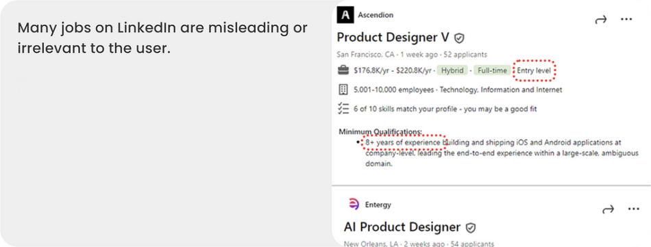
Misleading Jobs (source: Ashwin Mohan’s Portfolio)
Throughout my job search experience, present and past, I have learned a lot about how LinkedIn jobs works. But, after reading certain Reddit threads and googling stats about LinkedIn, I came to realize that LinkedIn Jobs is horribly built ONLY for job seekers — not for the hiring side of the platform.
If you Google and read:
LinkedIn usage statsLinkedIn’s official reportsI doLinkedIn reviewsLinkedIn UX case studies
You will quickly come to realize that LinkedIn Jobs is highly biased towards the business of hiring and has completely dropped the ball on ‘job search’. In comparison to platforms like Indeed or Simplify, LinkedIn Jobs drains the user’s productivity significantly.
Hence, I pursued a UX case study to help LinkedIn Design show some love towards its rather significant user group — job seekers! As a company committed to improving access to opportunities, I believe providing a desirable job search experience should be a thumb rule.
The productivity loss associated with LinkedIn Jobs
To view the full UX case study, click here
Those hiring unanimously seem to regard LinkedIn Jobs as a productive tool whereas job seekers don’t. In fact, LinkedIn boasts that 86% of small businesses get a qualified candidate within the first 24 hours of posting a job (source: LinkedIn Talent Solutions) whereas no such convincing stats are provided for job seekers even when they subscribe to Premium Career.
I’m aware that it is not the only way to job hunt on LinkedIn, and yes, networking should be an active parallel strategy. However, it is not everyone’s cup of tea, and LinkedIn knows that. According to LinkedIn’s Opportunity index 2020, 76% of users believe that networking can lead to better jobs but only 22% are actively pursuing that route (source: LinkedIn Data and Insights). Therefore, the jobs page is very much valuable.
As part of this case study, I spoke with several people in detail and here is what I found:
Every click matters! LinkedIn amplifies the stress inherent in job hunting by causing productivity loss
Navigating the job market is hard enough on its own and LinkedIn Jobs only seems to make it worse. Though I do believe in the saying, “harder the battle, sweeter the victory”, I don’t think job searching needs to be ‘made’ harder than it is. There are several aspects of LinkedIn Jobs that really need to be fixed. They include:
Elusive Filters
Job searching is not just about finding a job; there are several factors that go into it. LinkedIn’s iconic filter function was pretty much built around the nuances in job opportunities. While they’ve evolved with time with various features like ‘top applicant jobs’, ‘location types’, ‘easy apply’, and ‘salary range,’ etc., they are still ineffective as the overarching function of filters fail on many fronts.
Configuring LinkedIn filters and OpenToWork feature (source: Ashwin Mohan’s Portfolio)Filters have to be set each and every sessionFilters are not accurate — especially the experience filterOther much needed filters are missingIt is 2024 LinkedIn, there are 800,000+ employment-based visa holders in the US, and there is still no ‘Visa Sponsorship’ filter in the LinkedIn Jobs page!
source: USCIS
Curtained Job Listings
Filters only do so much in the job search flow, but all the filtering work is meant to ensure that every click thereafter is fruitful. However, that is not the case.
It is disheartening when you click a job and then notice that the required experience is much higher or it is just one of those dummy jobs…
source: reddit
As of today, LinkedIn job listings do not provide adequate differentiators for users to be efficient. While it can be argued that it is worth checking every job, I believe the order of viewing is the pain point here. Before they click the job, users want to know:
If they meet minimum qualificationsIf it is a dummy job; ones that is reposted several timesIf it is a redundant job. For e.g., companies like Google post the same job 10 times for each of their locationsIf the hiring manager is posted in the description. It baffles me that LinkedIn does not hint at this on their listing already as it can trigger engagement.If they have majority of the skillsContext Craving (source: Ashwin Mohan’s Portfolio)
Heavy Job Posts
A prominent brain drainer in the job search flow is the job description (JD). I’ve seen several LinkedIn posts on how to write an impactful resume but I’m yet to see one about how to write a concise, user friendly, accessible job description. To be absolutely fair, though JDs are sometimes annoyingly long, people have become good at parsing them effectively. Nonetheless, it does cause some amount of unnecessary fatigue.
Cognitive overload (source: Ashwin Mohan’s Portfolio)
Too many doors
if you are job searching actively, you are on the lookout for exciting opportunities all the time. Job alerts are set, notifications are turned on, OpenToWork preferences are configured, and other traps are in place. More recently LinkedIn introduced ways to find jobs easily using the concept of collections. While all these mechanisms are individually helpful, they work terribly in concert and overwhelm job hunters.
The idea of grouping jobs as tailored collections is great but there are too many of them. This only amplifies the opportunity cost and leaves users contemplating which collection they should check.
LinkedIn, did you forget Hick’s Law?
To make matters worse, different collections can show the same jobs, especially if they are duplicates. Ultimately, productivity is impacted in both instances: deciding where to check, and checking same jobs in different collections.
Hicks Law failure (source: Ashwin Mohan’s Portfolio)
In a time of AI revolution, LinkedIn Jobs should not be so primitive. In fact, AI should be the foundation of job search platforms, as it currently is on the hiring side of the equation. However, until we get to an intelligent job search assistant, there’s a lot of room for many impactful incremental improvements.
Here are my design suggestions
I think it starts with redefining the user. Traditionally, the user is defined as job seeker (active, passive, etc.). However, I believe redefining them as prospective candidates can not only change the way LinkedIn Jobs is designed but also fasten talent acquisition.
Redefining the user (source: Ashwin Mohan’s Portfolio)
Given that LinkedIn Jobs reduces productivity of the job seeker, HMW (How might we) design a jobs page that boosts job search productivity and results? AFSW (A fabulous solution would) enable users to search for jobs efficiently by reducing repetition, increasing transparency, streamlining access, and leading users to results where every job clicked is driven by commitment and converts to an application submission.
Rich Job Listings
Job Listing Redesign (source: Ashwin Mohan’s Portfolio)
Job listings must be more transparent as it can reduce clicks per page. Metrics like Date Posted · Visa Sponsorship · Experience Match · Skill Match · Hiring Manager Visibility · 2nd Connections are examples of valuable information many users including myself want to see upfront. Before I jump to next idea, I want to call out on 2nd connections as its value is unclear. It is no secret that referrals are more effective than cold applications. 2nd connections can help users on that front. Getting to know that there is a mutual connection between you and the person hiring or working in the company is the kind of information I’d pay for. It also double clicks on the value of networking that LinkedIn promotes.
OpenToWork centered filtering
OpenToWork flow Redesign (source: Ashwin Mohan’s Portfolio)
Honestly, every job seeker is tired of setting LinkedIn filters every session, but what is more annoying is that when you set OTW preferences, they seldom apply to your jobs page.
LinkedIn, why do I have to set the location every time?
Open to work preferences should be allowed to be translated to defaults filters for your job search. Furthermore, filters set in a session should be retained for the following session. It is great that LinkedIn gives users the freedom and control to set filters, but job search is not an erratic task.
Meaningful Filters
Redesign of Experience Filter and addition of other filters (source: Ashwin Mohan’s Portfolio)
Based on my research, I believe this has been a long-standing problem. While the visa sponsor filter is definitely long overdue, other meaningful filters have also been requested for a long time. Furthermore, the experience filter is totally unreliable and needs fixing. A quick A/B testing of some ideas I had suggested that the above format is promising (Note: tested only with 6 users).
Collections dropdown
Collections layout Redesign (source: Ashwin Mohan’s Portfolio)
In my opinion, shelving collections under a menu makes the page more usable and user friendly as it removes the need for choosing which collection to select first (Hick’s Law), and allows the user to focus on the job listings. While we are on the subject of listing jobs in a collection, I strongly think users would appreciate if duplicate listings are somehow grouped and not appear on multiple collections.
User-friendly Job Posting
Job Post Redesign (source: Ashwin Mohan’s Portfolio)
The recent AI additions to the job post section have definitely been a blessing for job seekers but the overall structure could still benefit from design intervention. Premium users pay to have insights about the job they are applying to. Currently, those insights are buried many stories below. Providing a tabulated structure will not only bring awareness to those insights but also enable users to access them easily. Additionally, giving the flexibility of viewing the JD as a summary or as a full post is highly empathetic.
Overall, I think LinkedIn has work cut out for them as far as jobs search experience goes, and I’m sure some of this is already on their radar. Hopefully, these issues will be fixed in the near future, and a better experience is provided to the talent populace. To view this full case study, click here.
Hey, LinkedIn: UX matters even for job searching was originally published in UX Collective on Medium, where people are continuing the conversation by highlighting and responding to this story.


