
I know. Our beloved Figma got more expensive with its price-adjustments earlier this year. The new prices and plan limitations have made me reconsider the design tool I use for my personal work. But it’s been tough finding a tool comparable to Figma.
After searching for Figma dupes, I started using Framer with the free version of the tool (I eventually upgraded to the paid, ‘Basic’ version). I immediately noticed its UI (user interface) was similar to Figma with a layers panel on the left and a design panel on the right. I felt comfortable creating frames and working with its equivalent to Figma’s auto-layout (called ‘layout’).
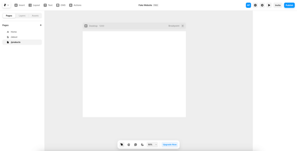
Framer file workspace
I thought I had found the perfect competitor to Figma… until I tried building a component in Framer. Because I formed habits while working with components in Figma, shaking these habits in Framer was difficult to do. In Figma, I double-click to drill-down and see a component’s build. If I do this in Framer, I’ll be taken directly to the master component in my Assets.
Double-clicking in Framer takes you to the asset
Since you can’t drill-down into a component in Framer, you can’t make implicit component overrides like you can in Figma. If I want to modify the placeholder text in the component, I have to explicitly allow for those overrides in the master component.
Though this experience doesn’t match my mental model built from using Figma, creating components in Framer is not difficult to do. It just takes some practice and a few extra steps.
Let’s review what these extra steps entail to build some robust components in Framer.
Table of contents
Identify a component and its elementsCreate a new componentCreate interactive statesCreate component variablesRepeat for all componentsUse the component variablesExpose variables in the parent componentTest the final component
1. Identify a component and its elements
For this demo, I am building a header component for a website. I know my header needs elements like a logo and menu items to represent the website’s main pages (About, Products, Profile).
Since I have elements within the header, I will need to create multiple components for the header:
Menu item componentLogo componentHeader component
Whether your component is a simple button or a complex input field, these steps can be used to create what you need for your Framer project.
2. Create a new component
Framer does include pre-built components you can pull and customize, but I typically prefer to create my own (as most designers do).
Steps:
2A. Select ‘Assets’ in the left-panel → Select the plus (+) icon next to ‘Component’ → Name the new component
Create a new component in Framer
2B. Use the design panel to customize text styles, colors, padding, etc.
Customize the component using the design panel
3. Create interactive states
Once I have the menu item styled as I want, I need to create interactive states for the component. For the menu item, I need states for Default (Rest), Hover, and Active (I already made the Default state as the primary variant).
Steps:
3A. Select ‘Hover/ Pressed’ below the primary variant → Select ‘Hover’
Interactive component states in Framer
3B. Select ‘Variant’ on the right of the primary variant → Name ‘Active’
Note: The ‘Variant’ selection can be used for states like active or disabled.
Default, Hover, and Active component states
Tip: You can preview the interaction by selecting the play button on the left of the layer name in the canvas.
4. Create component variables
Since Framer doesn’t allow for overrides in component instances, you must create variables in the master component (even for changing the text). For the menu item, I need a ‘Content’ variable so I can change the text for instances of the menu item.
Steps:
4A. Select the plus (+) icon next to styles in the design panel → Select ‘Create Variable’
Note: Only styles that can have variables have the plus (+) icon button. You can create variables for color, font size, layer visibility, etc.
Create a variable for a component in Framer
4B. Name the variable → Make any default adjustments in the popup
Tip: This is what will show in the component instances, so make sure the naming and defaults make sense.
Name the variable for the component
Note: You’ll see the field next to the style is changed to a purple fill to indicate a variable is associated. To change or delete the variable, select the purple field to open the variables popup.
4C. Repeat 4A to 4B for all required variables
Tip: You’ll need to create a ‘Link To’ variable to link the component to different website pages or URLs (found at the top of the design panel).
‘Link To’ variable in Framer
5. Repeat for all components
I need to repeat steps 2 to 4 for the logo component before I can build the header component.
Steps:
5A. Create the logo component (using steps 2 to 4)
Logo component for the header
5B. Create the header component
Tip: Insert (or drag and drop) the menu item and logo components from the Assets panel into the header component.
Header component
6. Use the component variables
Now that the header component is built, I can use the variables created in the menu item component.
Steps:
6A. Select the component instance to view variables (at the bottom of the design panel)
6B. Select the correct variables to modify the instance (I.E., text and links)
Use the component’s variables to modify the instance
6C. Repeat 6A to 6B for all instances
Note: The menu items are now named ‘About’, ‘Products’, and ‘Profile’ to match the website’s pages. I also linked each menu item to their corresponding page in the website.
7. Expose variables in the parent component
For the menu items, I need to change the state from Default to Active when I’m on a specific page (like the ‘About’ page). I can’t do this on the header component because it will show for every page the header is used on.
To do this, I need to expose the variable for the menu item’s variants in the header component.
Steps:
7A. Select an instance of the menu item in the header → Select ‘Variant’ in the design panel → Select ‘Create Variable’
Create a variable for the menu item variants
7B. Name the variable and select the default in the popup
Tip: The name needs to be specific to the instance. For the menu item for the ‘About’ page, I named it ‘About-State’ so I can easily identify it.
7C. Repeat 7A to 7B for each component instance
7D. Select the correct variable on the header per each webpage
Note: When the header component is selected, I can see the variables for the menu item states on the design panel.
Variants are exposed on the parent component
8. Test the final component
After the component is done, it’s time to test it out to make sure it’s acting as intended.
Steps:
8A. Insert the component into a page in the project
8B. Preview the page by clicking the play button at the top-left of the frame
Preview the page using the play button
8C. Take note of any errors to fix in the component
8D. Add responsiveness to the component
Tip: I added a mobile-friendly variant to the header component by hiding the menu items and replacing them with a hamburger menu icon.
Test the header component
That’s all there is to it!
It can be challenging to go from building components in Figma to Framer. But after practicing on a couple components in Framer, you will get used to the nuances between the tools (though I still double-click on components in Framer to change text).
If you’ve been looking for a Figma dupe, Framer is definitely a tool to consider in your search. To sway you more, Framer is a low-code/ no-code tool so you can quickly publish your design work with the domain of your choice (portfolio tool, perhaps?).
Let me know in the comments what you think of Framer if you’ve given the tool a shot.
Here’s the clear-cut way to build a component in Framer was originally published in UX Collective on Medium, where people are continuing the conversation by highlighting and responding to this story.


