Figma’s UI3: The Psychology of Adaptation
When Figma released its UI3 update, the design community responded with reactions ranging from excitement to frustration (the frustration seems to be prevailing).
The changes promised enhanced functionality and a more streamlined experience, but for many, the shift was disorienting. Understanding why it takes time to adapt to such updates requires delving into the concept of mental models, cognitive biases, and the psychology of change.
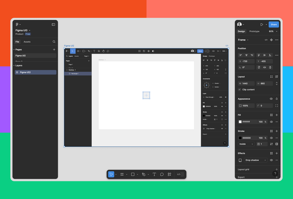
Figma’s UI2 and UI3.
Mental Models
A mental model is a cognitive framework that helps individuals understand and interact with the world. These models are formed through experience and are deeply ingrained in our thinking. They guide our expectations and behaviors, allowing us to navigate tasks effectively.
In the context of software, mental models dictate how we expect an interface to behave. For example, when I’m familiar with a particular design tool, I develop expectations about where functions are located, how they are accessed, and the steps needed to accomplish certain tasks. A significant update like the UI3 disrupts these expectations, forcing mental model reconfiguration.
Why Adaptation Takes Time
Adapting to a new mental model, especially in the context of software updates, is not instantaneous. This process can take anywhere from a few days to several weeks, depending on the complexity of the changes and the familiarity with the tool.
In my case, it took two weeks to acclimate to Figma’s UI3 update – a timeframe that aligns with psychological research on habit formation and cognitive adaptation.
When people are confronted with a new interface, the cognitive load increases. Our brains have to work harder to process new information and override previous habits. This can lead to frustration and a slower workflow initially. The cognitive load gradually decreases as the new mental model forms.
Some people may find it easier to adjust to changes due to high cognitive flexibility, while others with more rigid mental models may struggle. The time it takes to adapt is partly influenced by this factor.
Let’s explore the Familiarity principle, also known as the Mere-exposure effect. This principle suggests that we tend to prefer what we are familiar with. Duh. When a UI update disrupts this familiarity, it can lead to resistance. As we become more accustomed to the new interface through repeated exposure, the preference for it increases.
Anchoring bias is another cognitive bias that influences the acceptance of the new UI. It occurs as we rely heavily on the first piece of information that we encounter (in this case, the old Figma interface). The initial mental model acts as an anchor, making it difficult to adjust to new information. Overcoming this bias requires deliberate effort and repeated use of the new interface.
The Timeline of Adaptation
Adapting to a new mental model, such as the one required by Figma’s UI3 update, varies. Researches on habit formation are controversial. Some suggests that it takes an average of 21 to 66 days for a new behavior to become automatic, while others say it can take up to 254 days, depending on the complexity and commitment to the change.
First few days: I experienced a gradual learning curve. Frustration was common as the old mental model clashed with the new interface.
Week 1: Cognitive load started to decrease as I became more familiar with the new layout and functions. Some level of comfort began to develop, although efficiency was far below pre-update levels.
Week 2: I reached a point where the new mental model has been adopted. Tasks were performed with increasing speed. Reference to old habits occured occasionally.
One Month: Efficiency returned to previous levels. As of today, I truly can’t recall the old Figma interface from memory. I just switched back for the sake of this sentence — it’s a No from me.
I literally spent 5+ minutes looking for the top navigation actions.
As a Product person, I embrace the bravery it takes to do such change (over 4 million users will be affected at some point 
Psychology of Change
One of the key psychological aspects during the adaptation is cognitive dissonance. This occurs when the new interface disrupts the harmony between my expectations and reality. My brain is constantly reconciling the differences between the old and new versions, leading to moments of frustration.
Over time, habit formation takes place as I repeatedly engage with the new UI. The process of habit formation is gradual. It requires practice and patience.
The factor that influenced the most how I adjusted to this change is called growth mindset. By approaching the update with a willingness to learn and adapt, you can more easily overcome the initial struggles.
As the old UI is not going to be supported forever, I would encourage you to take it less seriously. This update is a textbook example of how mental models are disrupted and reformed.
Think of it as a game — play, explore, enjoy, adapt, and learn. Isn’t this how life works?

1. Super Thinking: The Big Book of Mental Models
2. Hooked: How to Build Habit-Forming Products
3. 100 Things Every Designer Needs to Know About People
Figma’s UI3: the psychology of adaptation was originally published in UX Collective on Medium, where people are continuing the conversation by highlighting and responding to this story.


