The rise of tools for everything and nothing in particular
This week, Apple shared an ad for the newest iPad, which shows musical instruments, arts media, various creative tools, and entertainment products stacked inside a giant hydraulic press which, predictably, crushes them into the form of the new device.
Tools of human creativity being destroyed and replaced by a soulless aluminium slab, also predictably, did not go down well.
https://medium.com/media/6dd4bf8628a01153b258a6aba9730d3b/href
The ad is still available on YouTube at the time of publication despite the pissed off artists, musicians, and, apparently, Japan.
I’ll be damned if I’m going to add to the inane discourse around how an advertisement is received, especially an Apple one. What interests me here is the way the ad illustrates a product design trend which is becoming the unfortunate standard of the global tech industry.
This is the trend of making what I call complicated sticks. Complicated sticks are complex tech products that are useful for everything and nothing in particular. Evident in these wispy ads that try to give a blanket impression of good vibes and positivity that’s more suited to fashion, fragrances, and marketing within flooded product categories, not supposedly innovative tech that helps us do things we couldn’t do before.
It’s an ad for blockchains, NFTs, and generative AI. It’s an ad for rationalism, techno-optimism, and effective altruism. It’s an ad for contextless drivel about user experience design and design systems divorced from any particular product association.
When these products work it’s on a fundamentally mechanical level like server uptime, or UI responsiveness, and not in any sense of satisfying a concrete task or purpose.
Sometimes they are described as “the Swiss Army Knife of X”. The ultimate trinket, the icon of product design lore despite being a tool-of-last-resort that sometimes serves — if there isn’t a butter knife handy — as an emergency screwdriver.
But product comparisons to the Swiss Army Knife are presented and interpreted as desirable selling points instead of a testament to the product’s novelty status.
Yet products without purpose still gather a following. People swear by them. Those people can only do that if they have found their own way to use the product. Their own purpose that the thing can satisfy. Like how a chimpanzee finds a stick useful for fishing ants out of the ground. The products are nothing but complicated sticks.
These products force the rot of their usefulness, or the “enshittification”, to live only inside the head of those that defined the terms for judging their usefulness, the business behind the product just implied the terms.
Finding the purpose is the fool’s errand.
Marketing that focuses on regular people’s specific purposes, or “use cases”, creates a criteria of success or failure for anyone that attempts to use it in that way. The industry trend is to avoid specific purposes and sell potential experiences instead.
User experience is now on par with brand experience. It doesn’t matter what the product does as long as it is lighter, smaller, easier to use, and industrial-designed by Teenage Engineering.
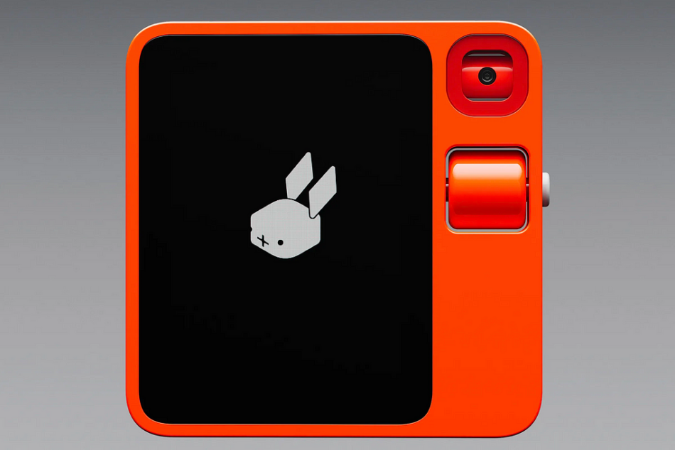
The Rabbit R1
Potential in place of purpose is what separates an iPad from an iPod, blockchains from databases, and generative AI from text editors. The more complex the product, the more potential it has to have potential.
Some people have paid a fortune for the Tesla Cybertruck, a barely capable electric “utility” vehicle, which they defend for its potential to iteratively improve and eventually match the abilities of any other vehicle in that category.
Potential distracts from purpose.
In order to move units these businesses need to prevent the product from taking solid form in our minds where we can begin to consider how it might be useful. It needs to remain as ethereal as possible. It has to remain in the realm of what the late Edward De Bono called “porridge words”.
There are two attributes that can make a product take that form in our minds:
A clear explanation of what it is forBeing a physical object which takes up space in the world
Perhaps counter-intuitively, a clear explanation seems to be a more potent form-giver than literally giving the product form.
For the iPad, it’s as if the advertised thinness and lightness are necessary features to draw as little attention as possible to its existence. Small and light enough to make it clear that it’s your fault for thinking a notebook-sized slab could serve any purpose better than a tailor-made tool (only if it fails to serve that purpose better than a tailor-made tool)
Browse the web sites of Notion, Figma, or Slack — check the celebratory discourse around OpenAI, Midjourney, Ethereum, or Bitcoin — look at the promotional material for the Apple Watch, the Vision Pro, the iPad — and none of them assert anything more specific than the abstract creativity, collaboration, health, wealth, or productivity.
They are tools for everything and nothing in particular. They are complicated means to undisclosed ends and they all dance around the same flaccid pitch of “here, see what you can do with this”
This article is also published at https://fasterandworse.com/complicated-sticks/
Complicated sticks was originally published in UX Collective on Medium, where people are continuing the conversation by highlighting and responding to this story.


