
When “don’t make users choose” is a lie — a crazy housing experience case from New York.
Interface by author
Why do we think that users don’t want to think?
Steve Krug’s Don’t Make Me Think was published 24 years ago and became a must-read for anyone in UX. The idea of creating interfaces that require minimal effort from users was groundbreaking at the time.
However, as much as the book has influenced the industry, the way we think about users has evolved. Ease of use is essential, but we’ve come to understand that not all interactions are about reducing thought.
Many UX principles that were once celebrated, like “designing for delight,” have lost relevance over time. Designing for delight is dead, and so it is time to bury the “users-don’t-want-to-think” design with it.
Serious decisions are not meant to be simple
In certain contexts — like real estate or financial decisions, medical choices, or complex tools — users want to engage more deeply.
They need to:
process information,weigh options, andmake thoughtful decisions.
Long-term decisions require thought and designs around such decisions should not be too simple. It’s about giving users the right information and the right tools to compare, filter, and evaluate.
A study: users weigh decisions more carefully than we think
In a study published in Personality and Social Psychology Bulletin, researchers found that people tend to turn down offers of “free money,” as well as unusually high salaries or suspiciously cheap services because they seem “too good to be true.”
Free cookie, anyone? — source
This psychological insight is critical for UX, especially when designing for decisions that require trust — like renting a home. Users aren’t just evaluating the surface value of a deal; they’re weighing social and psychological cues to determine if something feels off.
If your design or offer feels too perfect, too smooth, or too easy, it could trigger distrust.
For example, I’ve never understood the real estate agency websites that offer you the option to rent an apartment for thousands of dollars with just a few clicks. It’s that easy, apparently.
This feels like the ultimate “too good to be true” moment. You’re about to make a major commitment, and the process is designed to be as simple as buying a pair of shoes. And then there’s the cheeky copy — something like,
“Don’t worry, what you see is what you get”:
Totally trustworthy copy on a real estate agency website
Suspicious!
“Less choice” works only for short-term decisions
The idea that people want less choice was a popular topic with Harvard Business Review about a decade ago. It’s catchy, sure, but as Harvard explained, it’s because:
“an abundance of choices can cause decision paralysis and dissatisfaction, leading people to feel unsure about their decisions or regretful afterward.”
While this fear of overwhelming users with too many options is valid in some contexts, it has led to overly minimalistic designs, especially for long-term decisions, where simplicity can backfire and result in distrust.
Users want more choices for long-term decisions
https://medium.com/media/bd37d18b14c7b7aa63eecbdb2a70c19e/href
Real estate is a tricky area, and NYC is downright crazy. As of 2019, New York City had a total of 3,469,240 housing units. Out of these:
1,038,200 are owner-occupied, while a staggering2,183,064 are renter-occupied.
What’s even more alarming is that:
over half of all renters in the city spend 30% of their income on rent,and one-third of renters are spending 50%
And that 50% doesn’t even include deposits or furnishings, which can eat up the remaining income. It’s a broken system.
So, when building one of my projects — a real estate rental and co-living platform — I took the opposite approach of “don’t make me think.” Instead, I focused on offering plenty of choices. Plenty. Of. Choices.
Show relevant filters and make prices transparent
Users want to choose location, necessities, and price.
To make the location selection intuitive, we introduced a dynamic map search feature. Users can drag the map to explore different neighborhoods, and listings will update in real time based on their chosen area:
Interactive map with the option to “search as I move map”
2. Users want to choose amenities.
Some people can live without air conditioning, while others absolutely need their cat. We implemented toggle switches for essential amenities, allowing users to turn on or off the features that matter most to them:
Choose amenities filter — from AC to dishwasher
3. Users want to choose the best price for them.
In this design, users can see a clear breakdown of pricing based on different stay durations, move-in dates, and discounts.
We offer a choice of price:
Different flexible prices for the same apartment
Why not go beyond the usual choices?
Location, price, amenities — these are all pretty standard choices. But we decided to take the funnel of choice a bit further and tested an option where you can choose not only a furnished or unfurnished apartment but also what kind of furniture you want.
Here’s why:
People who already own furniture usually avoid renting fully furnished apartments.People without furniture struggle with the high cost of purchasing new items.On top of that, renting a fully furnished apartment often requires a higher deposit.
Our inspiration came from product customization on Apple’s site, where users can add or remove features:
Apple Customise Mac Studio lets you choose GPU and memory
Yes, users love playing dollhouses with their future apartments
We wanted to introduce something fun and practical — an option to customize your room or flat, much like you can do in The Sims. The idea was to give users the power to design their space, choosing everything from the type of furniture to the style of decor, creating a truly personalized home.
At first, the mission seemed impossible — how could we possibly take high-res photos of so many furniture sets and display them interactively in a room, like in The Sims 4 House Builder? The answer came from 3D modeling:
Building 3D furniture (screenshot by author)
So we turned to 3D visualizations, leveraging technologies like Octane and Redshift with Cinema4D. By using floor plans from Matterport (a 360° apartment tour tool), we built introductory scenes for our apartments.
The result? A 3D visualization process that’s 10x cheaper and 10x faster than a typical photoshoot in NYC while offering up to three different furnishing styles per apartment:
Inserting 3D furniture into an existing room (screenshot by author)
Here are some more impressive stats from the test phase:
92% of users visited the room pages with customization options and interacted with different furniture and rental items.3x increase in session duration — from 1 minute 26 seconds to 3 minutes 12 seconds.rooms with customization options had a 43% higher conversion rate compared to the average conversion rate for similar rooms in the same NYC areas.
And here’s a sneak pick into a heat map with a user playing with decorations:
User spends a lot of time choosing different pieces of furniture and/or electronics to rent along with the room
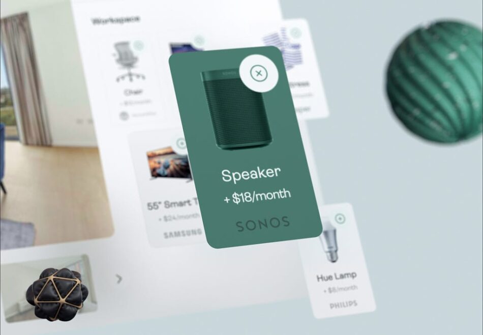
Yes, users care about details like matrasses and toilet paper
Going beyond furniture sets, we even offered the option to choose and rent small appliances like Alexa, smart lamps, speakers, etc:
For an additional $8 to $40 per month, you can rent small appliances
We wanted to offer things users wouldn’t normally go out and buy for just a 5–6 month stay. Even if they were used, the subscription was cheap and made sense — why invest in something you won’t need long-term?
For our co-living options, we even introduced a toilet paper and cleaning supply subscription. No joke. Designers who rent apartments love them:
Never run out of toilet paper again!
So, people liked to choose.
Talking about co-living, how about choosing who you live with?
“Worst roommate ever, ” New York-style
We even helped people choose who they would live with. It’s only fair—have you seen that creepy documentary Worst Roommate Ever?
Roommate compatibility is essential for successful co-living. So, why not let people choose who they live with?
We introduced a roommate questionnaire that helps users match with housemates based on key factors like tidiness, noise tolerance, and social preferences:
Roommates characteristics
For instance, some people are early risers, while others are night owls. Some might be super tidy, while others are more laid-back. This system allows users to gauge these traits through fun meters, like a Tidy-meter, Noise-meter, and Social-meter, before deciding who they want to live with.
Not “less choice” — just “more mindful”
The “don’t make me think” philosophy might work well for quick, simple decisions. However, when it comes to bigger commitments—like finding a place to live, choosing a roommate, or personalizing a home—users need more than an easy process. They need thoughtful decision-making paths that recognize the importance of their choices.
Mindful design means offering choices that actually matter. Instead of overwhelming users with trivial options, we can create a better experience by focusing on customization that truly adds value.
This approach helps avoid the feeling that everything is “one-size-fits-all” and combats the overconsumption that leaves people unsatisfied.
So, let’s ditch the “don’t make me think” mindset — it’s better to encourage meaningful, productive thinking.
Choice is not the enemy was originally published in UX Collective on Medium, where people are continuing the conversation by highlighting and responding to this story.


