
Tools and methods I use for interface animations, including Rive. We’ll also review an older project to highlight what to avoid and what works better.
Principles
When it comes to animations, they should be clear and unobtrusive, providing smooth transitions between object states without interfering with the main task. Animation primarily serves as a supplementary element of user interaction in an application or website.
It’s also important to create a consistent structure of micro-interactions within the product to form users’ habits for reactions to actions with an object. The main principle: animations should be used wisely to support functionality, not hinder it.
Choosing a tool
As a product designer, your choice might be quite limited, consisting of one or two tools for creating animations. I’ve experimented with the most popular tools such as Protopie, After Effects, Rive, Principle, and I can say that they are all quite similar in functionality.
Figma
Of course, you can create animations in Figma, but the animation functionality is quite limited. Personally, I find it faster, more enjoyable, and without functional limitations to do it somewhere else, like Rive.
If you want to create something similar (as in the video below), I recommend using After Effects, as it’s convenient for working with PNG-sequences. However, for most product tasks where you need to show a flow or behavior of certain elements in a design system, you can limit yourself to familiar tools like Rive.
https://medium.com/media/cad2bf07d9df2bea91bb78c6f8b201b9/href
Overloaded elements in animation
Let’s digress a bit. I’ll give one example of my work, I think I did it in 2020. In retrospect, I consider it less successful because each block and even text has its own separate animation when appearing. This seems excessive. Everything is done in the spirit of “movement for the sake of movement” which is definitely not about achieving user goals or a pleasant everyday experience. At the very least, all these unnecessary movements can irritate the user.
https://medium.com/media/08e90a6608e76f8dea6d14f91b374627/href
Concepts and references
Sometimes to come up with an interesting interaction for a concept, I look for references. It doesn’t necessarily have to be an animation; it can be layouts or pictures. The main thing is to latch onto details and develop your own idea based on their story, especially if we’re talking about a concept. To search for references, I often use Are.na
https://medium.com/media/875d5075912f60947ac7226f5df72d47/href
Alternatively, you can take a problem or a standard action, like “opening a menu,” and make this action more interesting, simple, or even playful. The main thing is to have a user-friendly approach.
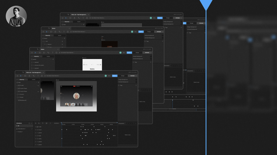
Rive
Let’s begin. I think if you already have experience in After Effects, understanding this tool will take a couple of hours. For a beginner, it will take a bit more time for experiments and studying the guide. I’ll explain the basics briefly; for detailed logic, you can refer to the guide or check their YouTube channel, where they explain each button and internal features well. I’ll just show the basics using a pre-created animation as an example.
Essentially, there are two modes here: “Design” — for creating and editing UI, and “Animate” — obviously for creating animation  . Inside the “Animate” tab, there are six columns, of which the main ones are:
State machine — this is the area where you drag timelines and manage them as “nodes”. Here you set logic, buttons, actions, and other parameters.Timeline — where you set keyframes and adjust easing.
I rarely use the “state machine” mode. However, there are cases when it’s useful to “click through” the interaction and discuss it with a developer/product manager — in such cases, it’s good to have a prototype, which is what the “state machine” is for. I’ll explain how I use this mode later.
I created a concept animation to show my worflow in Rive:
https://medium.com/media/d031b040b327f848c5f483a8977dd2ec/href
Transferring a layout from Figma to Rive:
It’s simple. Select the frame, Edit → Copy as → Copy as SVG, then open Rive, Ctrl+V → Go to the “Assets” tab and transfer our file to the layout. Easy, but there’s one thing. I transfer the layout “clean” without images inside, just shapes. So prepare your frame consisting of shapes in advance. You can add images later.
https://medium.com/media/37e77afa60da3b9abd217ecec88dd933/href
Working in Rive
I created timelines for each button state: hover, default state, and transition. In general, the logic is this: each state corresponds to its own timeline.
https://medium.com/media/856ecc49022de25e29ec76b4d3aee2dc/href
For each timeline, you can choose the playback mode or set a specific playback area by setting the “Work Area” mode.
https://medium.com/media/cf7aa6354edde4621b95d15752ace53e/href
I also created an icon animation on a separate artboard, where it has its own timeline and “state machine”. Then I add the resulting animation to the main artboard, to the button, using the “Nested artboard” tool.
https://medium.com/media/da05a5b68802733eb30bad33601476e1/href
I added a small glow on hover for the dark and light versions. For the system to recognize that it needs to produce movement for the layers, I attached a “Transform” element in the “Constraints” section to the blur layer, after creating a “Target shape”.
Then in the state machine, in the “Listeners” column, I created an action and selected the “Pointer move” mode — this mode will react to mouse movement and start the animation (timeline).
https://medium.com/media/f760326c80f0ed0002869f50db396c4b/href
Next, the resulting timelines need to be connected in the “State machine”. For this, I create triggers, in the “Inputs” column there are 3 types:
Number — this input contains an integer value and essentially stores numerical information.Boolean — this is a logical data type that takes one of two values: true or false. You can think of it as a switch that can be either “on” (true) or “off” (false).Trigger — this is an automatic mechanism that is triggered when certain conditions are met, like a “start” button that activates a predetermined function.https://medium.com/media/99e1897351d4cd36e8a86822b308c766/href
I assign an action to each trigger. Actions are created in “Listeners” column and consist of three parts:
Target — here you need to select the area with which the user will interact, in my case it will be a heatbox (a regular shape with a slightly larger area than the button itself).In the second point, you need to choose how the interaction with the target will occur, for example: “when clicking on the object”, “when hovering over the object”, etc. This is what I mentioned earlier when I created the glow for the button, namely “Pointer move”.Select the trigger by which the action will be performed.
Essentially, here you describe the logical state of the button and determine what exactly my animation should do when interacting with the trigger. For example: a click or mouse movement can start an animation or another specific function.
https://medium.com/media/b0aa8aebfa3b5750ee3de6393c6d9d15/href
Then I transfer the timelines to the controller and connect them as nodes. In the middle of each such connection, a transition key is created. By clicking on it, you can set your trigger for entering the animation in the “Conditions” tab. For example, if I hover over the button, the timeline will automatically move to the next timeline and so on.
Each action, including exit, needs to be specified as a separate condition and the value switched to true/false (depending on the action). You can gradually check the results by playing the animation and fixing errors.
https://medium.com/media/10fe11ea439223aacffe038f3c7529d1/href
The final result after linking all timelines in the state machine.
https://medium.com/media/500dd931c34acd0d8221fe0f1de746d7/href
Transferring animation to developers
I usually export the animation as a Lottie file, which can be integrated into a website or application. If I’m making an animation in After Effects, I use Bodymovin to create a JSON file based on the composition.
I can also provide a video/gif with the animation, which will also be useful, for example for transition animation, object, etc. Separately, I can attach parameters and description:
1. Trigger
2. Duration
3. Interpolation (i.e., easing).
All this information and more can be found in your Rive source files.
Easings, curves
Always test animations with different curves and adjust them based on how they are perceived by users. I would recommend studying this article from Material Design. It explains the principles of working with curves excellently.
https://medium.com/media/96e9b2a808d5ade56b9875d5b0b95a3f/href
My usual case
As I mentioned earlier, I use the state machine mode to “click through” the animation. However, for creating concepts for Twitter, and even regular transitions, I more often work in one timeline, which I then export to video.
For example, I made the desktop version of the video chat on one timeline. Then, to add a mockup or just show the animation on a beautiful background, I created a separate layer and transferred the finished artboard with the animation to another frame. This way, I avoid accidental changes and don’t spoil the already obtained result.
https://medium.com/media/d13e3c3188342a96e186760e8c0e0a3f/href
Recently, I’ve been trying to make the interface simple and interactions simpler, while focusing more on what emotions certain interactions can evoke in the user. After all, it’s very cool, and it inspires trust when, for example, the bank transfer process from start to finish is accompanied by smooth animation, which allows the user to stay focused on the elements and doesn’t throw them out of the flow. This creates a sense of care and friendliness.
https://medium.com/media/0a4f264091c2426f99e04cca9ac1c171/hrefFor example, in this flow, I tried to create a scroll animation that reveals additional details about the NFT without distracting attention from the picture itself as the main element. Instead, the additional object smoothly appears when scrolling, keeping the focus on the main picture. Such smoothness of action helps to maintain the user’s attention.https://medium.com/media/b27f78b95340fc2b8a58616cd78aded5/hrefThe idea is this: to make a static screen with a QR-code more lively. With a slight tilt of the phone, the position of the QR-code changes, creating a live interaction for the user without an extra click 
Conclusion
Ultimately, incorporating non-functional elements can enhance user experience, like “easter eggs”, which can add excitement to using the app. These little things can turn routine actions into a game or give the user a sense of control. All this is important to consider when developing animations and interactions.
https://medium.com/media/362faaddc225f41fd21a06ec10cfc3c2/href
Animation should help solve the task and support the user’s journey, bringing static and flat transitions to life with smooth animation. It’s important to consider speed, timing, and other aspects so that micro-interactions, on the contrary, push the user to faster task completion from point A to point B, increasing their confidence in the action.
 Follow me on my Twitter/X or Telegram channel, where I often post various interaction concepts.
Figma + Rive: sharing my workflow for UI animations was originally published in UX Collective on Medium, where people are continuing the conversation by highlighting and responding to this story.


