
How to reduce subscription churn (the right way).
I cancelled my Loom membership yesterday.
And I was shocked.
Pleasantly shocked.
Shocked at how easy and pleasant it was to cancel.
Which is rare. I’m so used to the guilt-tripping, shaming cancellation messaging of ‘are we breaking up’, ‘we’ll miss you’. Businesses pretending to care.
As well as the frustrating messaging, most companies do 3 big things wrong in their cancellation flows:
Hide the cancellation button deep within settingsLengthen time to cancel with multiple intermediary screensSpam people via email asking them to come back
LinkedIn does 1. Classpass does 2. And see my earlier analysis of Calm as a prime example of 3….
The funny thing is these offboarding strategies increase churn, not decrease it. By the end of this article, we’ll look at how a more user-first, ethical approach can drive higher win-back, reactivation and retention rates.
Before we get into it, let’s look at why I cancelled my Loom membership in the first place.
In Oct 2023, I first wrote about how Loom drives product led growth (PLG) with email, followed by a deep dive into acquisition loops in November.
Since then, Loom has continued to grow at an impressive rate.
After a $130 Series C in May 2021 led by Andreessen Horowitz and a $1.53 billion valuation, the announced in Q4 2023 that it would be acquired by Atlassian for $975 million.
In the 2023 end of year report, Loom reported that the number of videos recorded was up 24% on 2022. Not only that, but the number of video views were up even more at 37%, hinting at the network effects growing.Loom’s Year in Review
Not only has Loom continue to grow, but I’ve loved using it since my last analysis. I’ve saved time in dozens of meetings by sending pre-reads and analyses ahead of time, getting people prepped before the call.
I upgraded when I needed to send one particularly long video, more than Loom’s 5 minute usage time.
Now however, I’m seeing my subscriptions add up. So, it’s time to cull. To save a bit of money, and make sure I’m only paying for what I need.
So, here’s what happened when I went into my Loom account to cancel my paid subscription.
We’ll look at the UX, copy, design and the CRM that followed, and discuss why this is so much better as a churn reducing strategy versus other approaches.
Let’s go 
The Full Cancellation Flow: 5 steps in total
I typed Loom.com into my Chrome search bar. From Homepage, it took a total of 5 screens for me to cancel my subscription, with 6 clicks in total.
There was a lot in there, but crucially it felt easy, lightweight and quick. Most of it was a no-brainer, and nothing was hidden in the UI.
Apologies to those on mobile, will do vertical next time….
This is shorter than a lot of flows, and significantly easier to find in the navigation. From ‘Home’, I head to ‘Settings’ which is located 5th option down in the sidebar. Easy to find, easy to click.
In my Workplace Settings page, I see a clean UI and clear overview of my account. The linked text to ‘Manage Subscription  ’ is small, but its visible due to the bright purple (Loom’s primary colour) and it’s location in the top 20% of the page.
Tap, tap and I’m there. Easy peasy.
There’s some other really neat things about this page:
From a glance, I’m clear on the number of seats and price I’m paying — the largest fonts being ‘$15’ and ‘1 seat’I’m clear when my next invoice is, and the total amountIf I scroll, I can see a fuller overview of seats as well as what’s included in my plan as an overviewSee that the plan bill date and the next bill amount have been repeated AGAIN on this screen. Wild.
What’s nice is that Loom haven’t sneakily added any seats, unlike Figma. Who are notorious for large bills for extra seats.
With Loom, there’s no charge for collaboration — no paywall for sharing. A key aspect of their high growth rate.
My one pet peeve on this screen is the currency. I’m based in the UK, so having to do some mental maths for a currency conversion from the $15 isn’t ideal.
So, I tapped on ‘Manage Subscription ’ and headed to my account billing page.
UX writing done write
Yes, misspelled on purpose 
Coming into my manage subscription page for the first time, I’m very pleasantly surprised.
Don’t worry, there’s a zoomed in version below.
I looOooOoooOve this page. So simple and clear. There’s a theme of transparency, concise writing and clear actions across this flow that we see with each screen.
This is an example of strong UX writing. According to a recent article by Anna Kaley of NNGroup, UX writing can be defined as:
The practice of writing carefully considered information that addresses people’s contexts, needs, and behaviors. Writing copy involves many of the same skills as visual or interaction design, except writers use words instead of pixels to communicate with users throughout the experience.
She goes on to say how copywriting is often rushed and skipped, yet they can be the more complex part of product development. When done right, UX writing can go a long way:
Quality content speaks clearly to people, builds trust, and compels action toward organizational goals. — Anna Kaley
Given the copy is a little hard to see on my zoomed out desktop screenshots, here’s an analysis of just how great the UX writing is on Loom’s manage account screen:
** heart eyes **
Notice the repetition, I’ve been told price, seats and next invoice date twice in 3 screens. Repetition is key, given that — according to a 2008 study — users typically read 20–28% of the words on a page.
I reckon that % read rate is higher on this screen, given the intent of the audience, how far down funnel they are and the fact is their money involved.
However the point still stands that repetition of key details is crucial in cancellation flows to give users the confidence that you’ve got it, you’re on it and you can be trusted.
After tapping the white CTA ‘I’m sure I want to cancel’, I’m onto a two-step flow that asks my reason for cancelling and shows me what I’ll be missing.
The number of steps is outlined nicely at the top of the page. I’m given nince options, written in hyper-specific language.
Notice this is all written in first person.
When I tap on one, it expands so I can add extra details.
What I like here is that this language feels customer-centric — as if it’s taken directly from the mouth of users.
And it should be.
By poaching the exact wording from your customer calls, you can write excellent copy. Something Daphne Tideman explains in her article: How to write copy that converts… by stealing copy.
A key mistake many businesses make (early stage and late stage) is using words to describe the product that are used internally. What matters is how your customers see things, not language that has no meaning in an average conversation.
Lastly, I get to the final page before cancellation: What to Expect.
And what a juicy page it is.
Loss aversion, but not too pushy
This last step is often where people tell you the benefits of sticking around, give you a discount or tell you what you’re missing.
Here, Loom has opted for the latter: FOMO.
Loom uses three interesting psychological tactics here:
 Loss Aversion: to show people what they will be missing without premium
Sunk Cost Effect: to show that it would be easier to keep doing something as a result of previously invested resources (i.e. keep creating videos on premium as I’m already over the 25 max limit)
The Endowment Effect: which describes how people are more likely to want to keep something they own (here, I’m told to delete some of my videos to record more, RIP my old vids)
A zoomed in version below so you can see the nice UI details 
The copy outlines what users can expect when they cancel, listing out what they will loose access to, and the freemium usage limits they’ll be subject to.
So fresh and so clean clean
Some key points on this screen:
It is personalised: I see I am over the limit with 35 videos, meaning I’ll have to delete 9 to record anotherIt’s concise: I particularly like the little icons, and the UI manages to do a lot with a littleIt’s clear: I’m left confident on the new usage limit of 25 videos (of 5 mins each), and that I’ll no longer have access to 4 premium features (which, to be honest, I had no idea were there)
I also wonder whether, this page is doing some extra work, and solving a few assumptions as to why people cancel:
People don’t know the difference between free and paidPeople are are unaware of the impact the downgrade will have on their experiencePeople don’t know the effort it will take them to delete videos once they downgrade to get back under the usage limit
I wonder whether testing on this screen has reduced the cancellation rate.
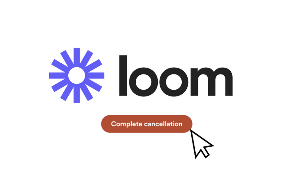
But not for me, I click ‘complete cancellation’.
After which I’m pleasantly surprised that Loom listened to my wishes and allowed me to cancel. Without any pining me to stay. Just clear UX writing, again.
Yipee! Done in 6 clicks.
Within 1 minute, the key details were also confirmed via email.
CRM: a fast-follow email
Within 1 minute, the key details were also confirmed via email.
No guilt tripping to see here, either. No ‘we’re sorry to see you go’.
Instead:
Hi Rosie,This is confirmation the Rosie Hoggmascall’s Workspace Workspace is scheduled to be downgraded to Loom Started, effective on Jul 31, 2024.You will have the following workspace limits:- 25 Videos per user- 5 minute recording lengthThe workspace will lose access to:- Custom branding- Engagement Insights- Shared LibraryIf this happened in error and you would liketo reactivate your plan, head to your Plan & Billing settings or get in touch with our sales team.The Loom Team
Simple, to-the-point. And notice how it covers the same information as the cancellation flow: what, when, why, and the impact you’ll see to your experience.
With the last line too, they’re guarding against involuntary churn — cancellations by mistake.
Did you notice the spelling error on ‘the’ instead of ‘that’? As well as double ‘workspace’ in the first line? 

All in all, a clear and helpful experience. I come out the other end feeling good, that my admin is done and that I trust this brand so much I’d be happy to resubscribe again later if and when I need.
The benefit of ethical cancellation flows in reducing churn
There’s a few big reasons people churn. Some are voluntary (intentional customer actions) and some are involuntary (by accident). The biggest reasons for churn are generally as follows:
Poor customer experience (unmet expectations, a complicated UI or failure to deliver on proposition)Lack of engagement (making sure people don’t feel neglected or undervalued)Competition (how easily they can switch to something with the same or better features or pricing)Pricing sensitivity (value for money)Poor customer support (low, unhelpful or hard-to-reach customer service)Product issues (bugs, frequent downtime or outdated features, failed payments)Poor onboarding experience (confusing or overwhelming onboarding process can result in early abandonment)Changing customer needs (and the business failing to stay up to date)Impact of reviews and reputation (negative feedback out in the wild can harm the brand)
Now, there’s a lot there.
But tell me this: which of these can you solve by telling the customer ‘we miss you’, ‘we’re sorry to see you go’ or ‘we’re breaking up’?
You could argue no. 2: lack of engagement. However if you only show you care when they leave, this comes across as disingenuous and negatively impacts the brand.
If a user churns for any of the 9 reasons, the solution is not to guilt trip or shame them for leaving.
When you create negative emotion in an offboarding flow (like shame, anxiety or guilt), you significantly reduce the chance that the customer will come back later. You harm your chances at reactivation.
Instead, you want to build trust in your brand and leave the door open for when and if they want to come back. Maintaining a good relationship is key.
Perhaps adding friction to off-boarding flows increases short-term revenue as users give up. However you end up harming longer term lifetime value (LTV), reactivation rates and ultimately brand perception.
In conclusion: do the right thing for both business and customer
We can learn a lot from Loom’s off boarding flow about how to creating a positive lasting impression of the brand. Here’s 5 key takeaways from the analysis:
Focus on clear UX writing: make sure you write copy in a clear, transparent and helpful way. Where possible, use exact phrases from customers to avoid jargon.Avoid emotional language: aim for a neutral-to-positive sentiment from users throughout your flow. Avoid phrases ‘we miss you’ and ‘we’re breaking up’ like the plague. Go for clarity and transparency over guilt and anxiety.No hide and seek: make sure you’re not hiding anything behind screens or lengthy paragraphs. If users want to cancel they will, and you’ll lose their trust by deceiving them or hiding buttons deep in settings.Show users what they’re missing: Play into loss aversion by stating how their experience will change when they downgrade. Keep it neutral and objective in the language, and personalise details and data where possible.Follow up with email: Confirm the details via email, ideally ASAP so there’s no doubt that the changes have been noted.
Curious if you’ve seen any particularly good or bad experiences out in the wild? Let me know in the comments
I was shocked when I cancelled my Loom membership—here’s why was originally published in UX Collective on Medium, where people are continuing the conversation by highlighting and responding to this story.


