Weekly curated resources for designers — thinkers and makers.
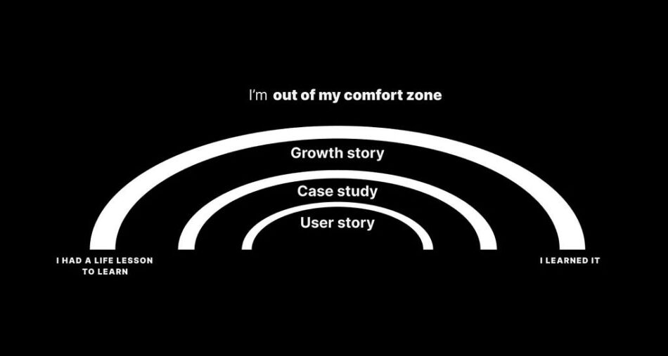
“And in that moment I realized I was a character. And I had the chance to write that interview story as it was happening. Many literary characters experience conflict, but the real drama of a story begins after that conflict. A well-written character has agency to shape their destiny. Staying angry is the boring way out. Being the protagonist of a behavioral interview story is way more exciting.”
You’re not stuck; you’re just in a story →
By Joe Bernstein
data.to.design — Fill your Figma designs with your own data →
[Sponsored] Populate your designs with real data. Import Google Sheets, Notion, Airtable, CSV, JSON and automatically fill cards, profiles pages and any repeatable UI elements with a single click. Plus, apply data to specific component properties to take your prototypes to the next level.
Editor picks
Did we fail to develop the next generation of designers? →
Understanding where we’ve been and where we can go.
By Edward LiuTo be a designer is to be a facilitator →
How to build a shared understanding of complex issues.
By Marielle Sam-WallThere are passengers who are large →
An odd collection of questionable content decisions of Spain.
By Rita Kind-Envy
The UX Collective is an independent design publication that elevates unheard design voices and helps designers think more critically about their work.
Poly Mono: a font inspired by 8-bit video games →
Make me think
Super cute please like →
“Before long I was watching SHEIN hauls. There are millions of them on TikTok. In each haul, a woman rips open a plastic bag filled with smaller plastic bags filled with small plastic clothing. Sometimes the woman holds up each garment and narrates its merits, but often the clothes are disembodied, laid flat on a floor or a bed in an accidental stop-motion animation.”Hidden vs. disabled In UX →
“Both hiding and disabling features can be utterly confusing to users. And for both, we need very, very good reasons. Let’s take a closer look at what we need to consider when it comes to hiding and disabling — and possible alternatives that help enhance the UX.”Visual design rules you can safely follow every time →
“Pure black often has uncomfortably high contrast with other colours, and pure white is too bright. Use close-to-black and close-to-white instead. Any other references to “black” and “white” in these rules assume you’re following this rule.”
Little gems this week
What we can learn from the guy who regrets making pop-up ads →
By Beth J
Enhancing your design skills by adding more dots →
By Kelly Smith
Deceptive patterns in the era of AI writing assistants →
By Chiara Santella
Tools and resources
Be heard →
The reasons why your team is not listening to you.
By Joanna WeberThe Z-Inspection →
A method to evaluate an AI’s trustworthiness.
By Tetiana SydorenkoHow to become a Senior Designer →
Tips from an ex-Google, Meta Designer.
By Yutong Xue
Support the newsletter
If you find our content helpful, here’s how you can support us:
Check out this week’s sponsor to support their work tooForward this email to a friend and invite them to subscribeShare open positions on our job boardSponsor an edition
Next gen of designers, deceptive AI patterns, becoming a Senior Designer was originally published in UX Collective on Medium, where people are continuing the conversation by highlighting and responding to this story.


