
Opinion
Designers going all-in on user-facing high fidelity visuals are abandoning their most powerful tool for influencing strategy
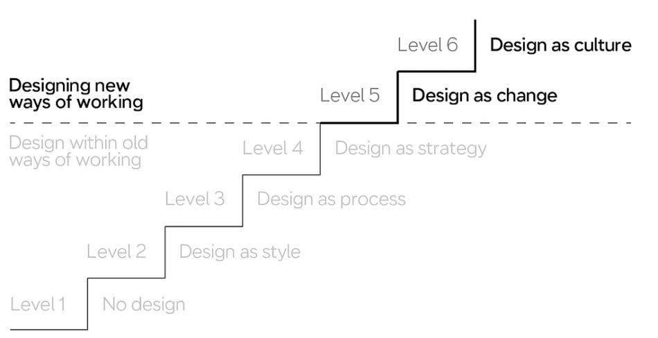
The Extended Danish Design Ladder introduces a concept that has changed the way I think about building Product and Design practice.
While the four rungs of the original Ladder covered how to make better products, the first new addition — Design-as-Change — suggested that we could design an org that’s better at making products. In the same way that we can iterate towards a product designed to achieve the goals of our customers, we can also design the ways we work to progressively meet our own needs as professionals.
But the linear Ladder implies that the journey towards higher design maturity is linear. It’s not! Just as the iterative journey towards a better product is not one straight line, building a practice involves many forks in the road.
As Design practice has optimized its processes towards delivering refined visuals, it has prioritized one customer over another: product-based tools for the end-user over process-based tools for the internal stakeholder.
In doing so, it has embraced the superstructure over the base and stepped away from the very mechanism that makes Design-as-Change possible. To reclaim it, designers need to get out of the deliverables business and reclaim low fidelity design for problem framing.
Output culture, impact culture
“No time to think, gotta shake!” –Praporschik proverb
There’s an anecdote from early in my career that I like to use to illustrate this problem. A client asked for my help with scoping and building a new product; the 0->1 phase, or what Amazon calls a Minimum Lovable Product. I spent a week taking their product manager through the standard motions: developing the customer persona, mapping out the current-state user journey, and so on. They had done none of these things before, and we managed to cover a lot of ground in a very short period of time. I was proud of what I had achieved.
But at the end of the week, the PM was dissatisfied. He told me: “We did a lot of work over the past 5 days. But did we actually make a week worth of progress?”
The question took me by surprise. I wrapped up that meeting as gracefully as I could, asking for trust in the process and buying myself enough time to figure out how I could demonstrate how far we had come.
This product manager was more outspoken than most, but hardly an outlier. The majority of clients my team worked with were “legacy” companies, where the development team was still referred to as “IT” and Agile was a novel idea worth looking into one of these days. Unsurprisingly, their product orgs were the epitome of output cultures. Just like X hours of production line work would produce Y tons of steel or doses of medicine in their factories, X hours of office work was expected to produce Y feature requirements, or mockups, or lines of code.
But that’s not how Amazon worked.
Being 1 week into a 4-week research and design project did not mean that we would have ¼ of the screens designed and ready to share out. Indeed, the first week was usually for getting the team aligned and pointed in the right direction; we weren’t even talking to users yet, but just connecting with executive sponsors and experts to define the business problem and the lay of the land.
Design is a machine for destroying ambiguity
“Every system is perfectly designed to get the results it gets.” –W. Edwards Deming
I had made the mistake of not setting expectations with that product manager that this would be different; that the company had hired us because it would be different.
I could not make the impact I wanted because I had focused too much on the customer of solution delivery (the user) and not enough on the customer of the problem definition (the build team). Without changing the semantic environment governing the client’s product decisions, my team would continue struggling to make traction.
Just like Jared Spool’s perpetually unsurprised executives, these PMs came from a high-ambiguity semantic environment where a shared problem framing was not required, expected, or necessarily desired. They were used to designers producing “deliverables” and could not immediately recognize the work I was putting out as “progress” because it didn’t fit that mold.
I had to find something that still had meaning in this type of context, yet would allow me to bring the problem definition up to the necessary level of fidelity to move forward.
With the next customer, I didn’t wait until they asked me the question to do something about it. The very first thing I asked them for was a quick and dirty scenario: how does the customer encounter the problem, what’s stopping them from solving it today, how will this feature help them overcome it, and why should the business care?
I put that scenario into a storyboard to help the team visualize the experience they were describing, and asked: “Is this idea something we can get buy-in from our execs for?”
Professional drawing tip from professional artist Nathan Pyle
The answer was a resounding “no!” Participants immediately started pointing out what was missing. The problem was too vague. The benefit was too little. The scenario didn’t fit the existing workflow. Everyone had a different idea of the desired experience in their heads, and didn’t realize it until I gave them something to look at so they could say “this isn’t it.”
Rather than framing design in terms of outputs that could be produced for downstream delivery engineers, I used it to illustrate the inputs that were provided by Product. Creating a common visual that everyone could look at instantly made it clear that the inputs were insufficient, and gave me the opportunity to frame the missing pieces. It didn’t matter that the visual fidelity was nonexistent, because I wasn’t using the storyboard to communicate visuals. I was using it to communicate something far more important: a conceptual model.
At the end of that week, I didn’t hear “did we make five days of progress.” What I heard was “We came so far from where we started.”
Storyboards prompt more questions than they make statements. That’s working as intended.
Lo-fi is the answer to moving back up the value chain
“The hand is the window on to the mind.” — Immanuel Kant
In the era of Figma and design systems, low fidelity design has a bad reputation. When I defend it, I am often told that stakeholders give bad feedback on lo-fi visuals, that skipping over storyboarding or wireframing saves time. Indeed, if time-to-output is the main way you are measured, then the only way to improve design’s contributions is to reduce the amount of design that gets done.
But the biggest value of design is not delivering a thing faster. It’s delivering the right thing faster.
Designers who don’t see value in working lo-fi are focused on the area they are allowed to contribute to: visual fidelity. But lo-fi design is a tool for conceptual definition. Design is excluded from contributing to that process in low-maturity orgs, so at first blush those designers are right when they do not see the value. They seem correct when they express frustration with highly abstract sketches and vague “text goes here” prompts.
But skipping the low-fidelity stage also means abandoning their best tool for making the case that they should be involved.
If it’s good enough for computer science researchers, it’s good enough for designing a button.
Because high-fidelity visuals don’t actually create clarity. Rather, they hide the fact that the work wasn’t done, with detail that is every bit as fake as the sketch — but enough to satisfy stakeholders who are looking for an output.
Low-fidelity artifacts don’t leave anywhere for ambiguity to hide. They are a very fast way to call out all the questions that we don’t have answers to — if we dare to ask them. More importantly, they provide a structure of what the answers need to look like, which both makes answering them easier and establishes the designer’s expertise and authority as someone who knows what they are looking for rather than repeating “it depends.”
There’s no hard and fast rule for the right way to do design. Your ultimate source of truth should always be the user. But they are not your only customer, and no artifact can provide a faster feedback loop than lo-fi designs. The only question is how well your practice is set up to take advantage of it — and how well you’ve prepared your stakeholders for participating in it.
Low fidelity design is higher up the value chain was originally published in UX Collective on Medium, where people are continuing the conversation by highlighting and responding to this story.


