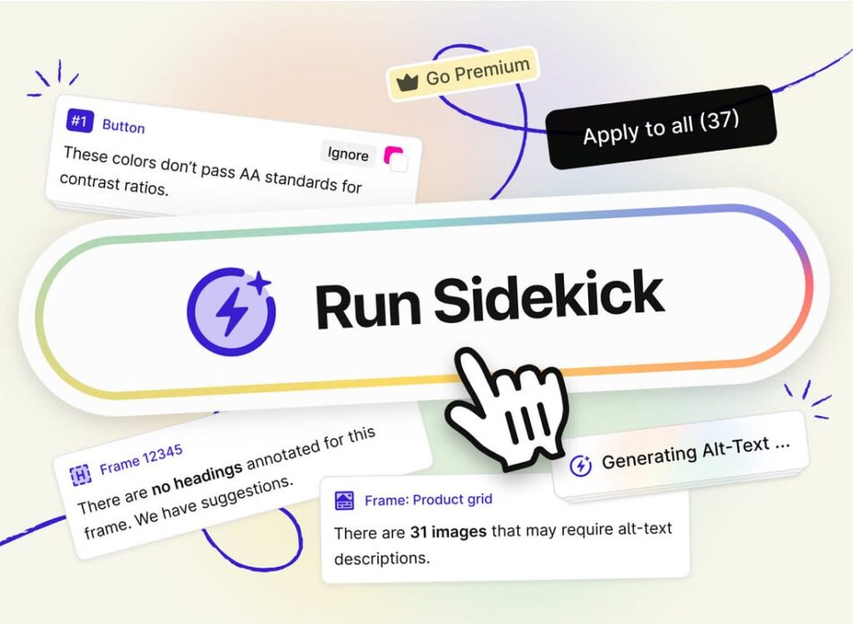
The promise of AI as a workflow accelerator for the UX process is a given. As I pointed out in a recent article is the great promise of AI is that “AI will reduce our “busy work” load by automating processes, aiding research, and so on.” What has frustrated me is finding solid examples of AI doing just that. In a course I am developing for LinkedIn Learning I found one when I encountered the updated version of Stark’s Sidekick tool for Figma.
Stark is all about Accessibility when it comes to UX Design in Figma and Sidekick is an integral part of the Stark plugin set. The recent update to Sidekick- Sidekick V2- provides the Design and Development team with a tool that does, indeed, apply AI to reduce your “busy work” when it comes to Accessibility.
The first major change to Sidekick is, it no longer appears at the top of the Stark list. It is still there but is now run by first clicking “Auto Scan & Fix”. That name states exactly what it does. Sidekick uses AI to literally zip through a selected frame or series of frames to note WCAG violations, potential violations and the elements that pass. It then lists them and suggests fixes based on the full Stark Plugin set.
In this example, Sidekick has found 30 violations, 3 Potential violations and 24 elements have received a passing grade. Sidekick then segregates the violations based on a Stark tool. In this case there are 16 Contrast violations, 1 Typography violation and 12 Alt Text violations.
The Sidekick interface let’s you scan a selected frame or all of the frames in a document.
In this illustration I have selected a violation regarding the EXPLORE MORE button. As you can see it fails on all counts. You may wondering what those numbers relate to. All of the Stark tools are tied to the Web Content Accessibility Guidelines (https://www.w3.org/TR/WCAG22/) which are a part of the W3C.
Contrast violations are shown along with the WCAG guideline.,
The minimum contrast ratio for small text is 4.5:1 and for large text the minimum is 3:1. Both of those values are shown. Stark is telling me the contrast between the background and the text has a ratio of 2.28:1 which is well below the guideline. It then suggests a “fix”. In this case it is easy- darken the background color. By clicking the first color chip, the ratio, as shown, moves into compliance. Stark then asks if you want to apply the change to just this instance or to all of them. If this button is part of a Design System, you may want to hold off on making the decision but, if not, problem solved with a mouse click.
Changing the contrast moves the button into compliance and can be applied to all 5 instances.
(For those wondering about the AAA category, it is for companies and organizations where strict compliance to the WCAG guidelines is required.)
When dealing with Accessibility, one of the biggest “Busy Work” issues involves Alt Text. Getting it right takes time and is necessary for any number of reasons. This is where Sidekick’s AI really does make the designer’s life easier.
When I first ran Sidekick, it told me there were 12 Alt Text issues meaning either there was no Alt Text or the Alt Text associated with the image is not in compliance. In this case there was no Alt Text.
When you open the Alt Text category, Stark not only tells you it is thinking but, when it finishes thinking, suggests possible Alt Text and versions of the suggested Alt Text. Click one and you are taken to the image. What really impressed me was the one shown below. Not only did it suggest the Alt Text but included the text on the sign in the image.
Sidekick’s Alt Text suggest are a serious workflow boost.
Potentials are elements that may violate the Guidelines. As shown below, there are issues with Focus Order, Landmarks and Headings. These are not mission-critical issues. They point out potential WCAG violations and you can decide to resolve them or not to resolve them.
Potential issues are those which don’t necessarily need to be addressed.
Conclusion:
Founded in 2017, Stark has been focused on accessibility and inclusion when it comes to Web Design. The wizards at Stark are constantly updating the tools in order to provide UX Designers and Developers with the tools needed to build accessible products that comply with governmental and corporate Accessibility standards. Between then and now, Stark has become a “Go To” tool that helps designers and developers ensure their products are both inclusive and Accessible.
This update to Sidekick, released in March of this year, with its heavy reliance on AI has moved from a Beta version to its current version in a very short time. As you have seen Sidekick’s key features include:
The ability to scan a frame or series of frames. A serious productivity boost.
Results are categorized. As you have seen, this makes resolving the identified issues much easier. This especially true when dealing with Alt Text.
Apply all. This is a killer feature. My example had a contrast issue with 5 copies of the same button. A simple click after moving the issue into compliance applied the change to all five buttons.
Further Reading:
Enhancing User Experience with Stark Accessibility Tools
Anuj More
The WCAG Explained
Stark
Supercharge accessibility with Sidekick from Stark was originally published in UX Collective on Medium, where people are continuing the conversation by highlighting and responding to this story.


